I decided I needed a professional looking website as I have a couple of exhibits coming up. It was kind of a lot of work, and I probably paid way too much for the whole package (domain name, web hosting, design templates...) but I'm very pleased with the result.
www.sarahcurllarsonart.com
I remember I had to make a website freshman year of college for a graphic design class and mine was pretty horrendous. We built them from this really bad Adobe program that no one uses anymore and the color got skewed when they were published, so it made my already bad design look even worse. I didn't understand design at all then. Not to say I do now, but I have an idea that a website should be clean, easy to navigate, and eye-catching. It's not about cramming as many weird little images and superfluous design elements onto a page as possible. That's one of my pet peeves, in fact: badly designed websites. When I'm perusing yelp looking for a restaurant to go to that night, I won't go to one that has a bad website, even if it has good reviews and the menu looks delicious. It just makes you have less respect for that business. So I hope people like my website.
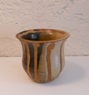
What else is new...I've been hard at work in the ceramics lab. I've been pursuing the same theme of my paintings with my pottery. Mostly I just make these little vases, then add stuff to them and carve them. My friend told me that I'm not very adventurous, but all my vases turn out very unique. I also bought a set of underglazes with a gift certificate my sister gave me for my birthday, so I'm super excited to use them! I like bright colors, if you hadn't noticed by now, and that's hard to achieve with the glaze selection available.
Here are some pictures of some of my pots:


No comments:
Post a Comment